Gyre SDKDOCS
UI Components

In any image editing application, the form input is usually more complex than just standard form elements like text input, switches, or sliders. ComfyUI nodes also struggle with this problem, resulting in text input for configuration of node parameters (e.g., gradient values as string instead of colorful gradient sliders). With our powerful form editor, the end-user can adapt new workflows directly inside the main application as dialogs. Providing these users powerful UI components is key for having an overall professional and easy-to-use interface.
We also offer direct configuration for splitting one string value into several values, which can be assigned with our Gyre mappings tool to each ComfyUI node parameter.
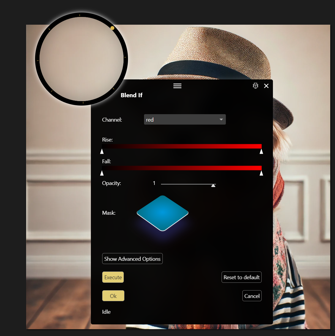
Gradient slider component used two times in a dialog.
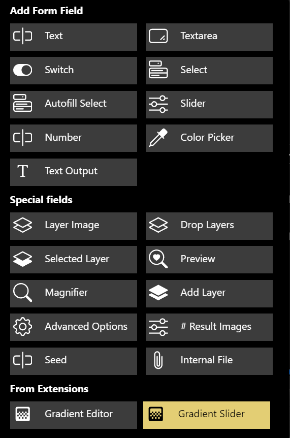
Same component offered in form editor so non-developer can use it for any workflows.
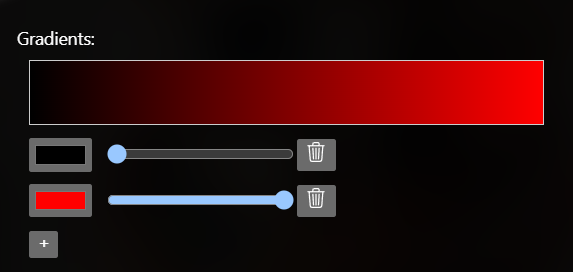
Example
Using split_value_num=2 and split_value_type=number, the above example will provide:
- A field “gradient” with the value string “0;1.0”.
- Field “gradient_0” with the float value 0.
- Field “gradient_1” with the float value 1.0.
These fields are utilized in Gyre mappings.
Manifest
After you have developed and tested your UI element in a separate project, add it to Gyre with a component manifest in gyre_entry/gyre_ui_components.json use plugins array. Follow the syntax of this example:
JSON Structure
Root Object
- copyright (string): The copyright information.
- components (array): An array of component objects.
Component Object
Each component object has the following structure:
- name (string): The name of the component.
- tag (string): The HTML tag for the component.
- js_path: Path to the JS file of the ui component.
- icon (string): An SVG icon representing the component.
- parameters (object): An object containing the parameters for the component.
Parameters Object
The parameters object contains key-value pairs where each key is the name of a parameter and the value is an object with the following structure:
- type (string): The type of the parameter (e.g., “text”, “textarea”).
- default (string): The default value of the parameter.
- label (string): The label for the parameter.
Example
Here is an example of a JSON manifest for two components:
Gyre API
Have a look at the Gyre API for documentation of the global API which is available here. For that special component type, there are two individual parameters:
globalThis.gyre.workflowIdis set to the workflow-ID of the current open form.formElements: form elements of the open form including current values.